
CLOSE
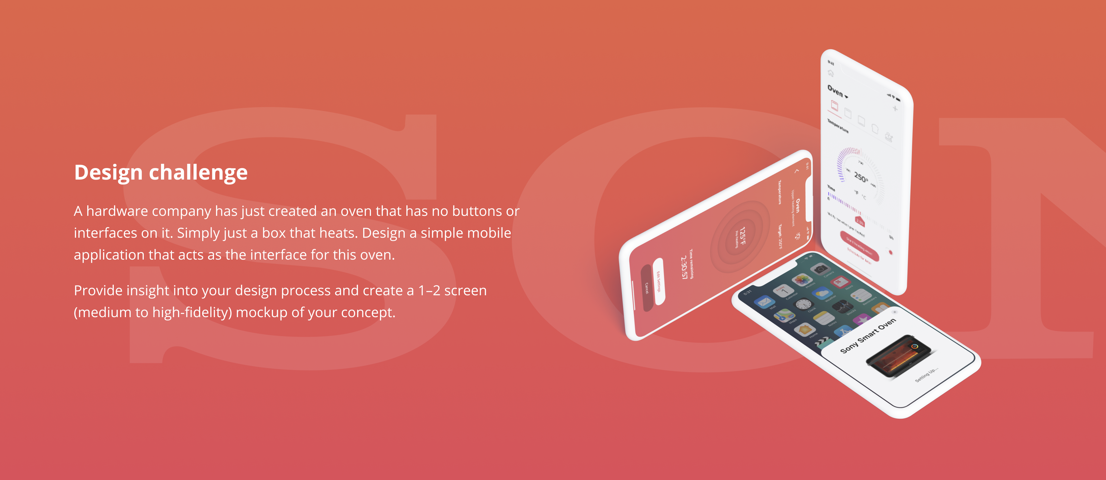
A hardware company has just created an oven that has no buttons or interfaces on it. Simply just a box that heats. Design a simple mobile application that acts as the interface for this oven.
Provide insight into your design process and create a 1–2 screen (medium to high-fidelity) mockup of your concept.
With respect to product design, I dedicate most of my time on research and planning. Once all the needed puzzles are in place the execution of the design is mostly a matter of selecting the right patterns for the desired result especially when there is no data to prove otherwise.
If planning and research is done well the execution of a design like this shouldn’t take more than an hour.
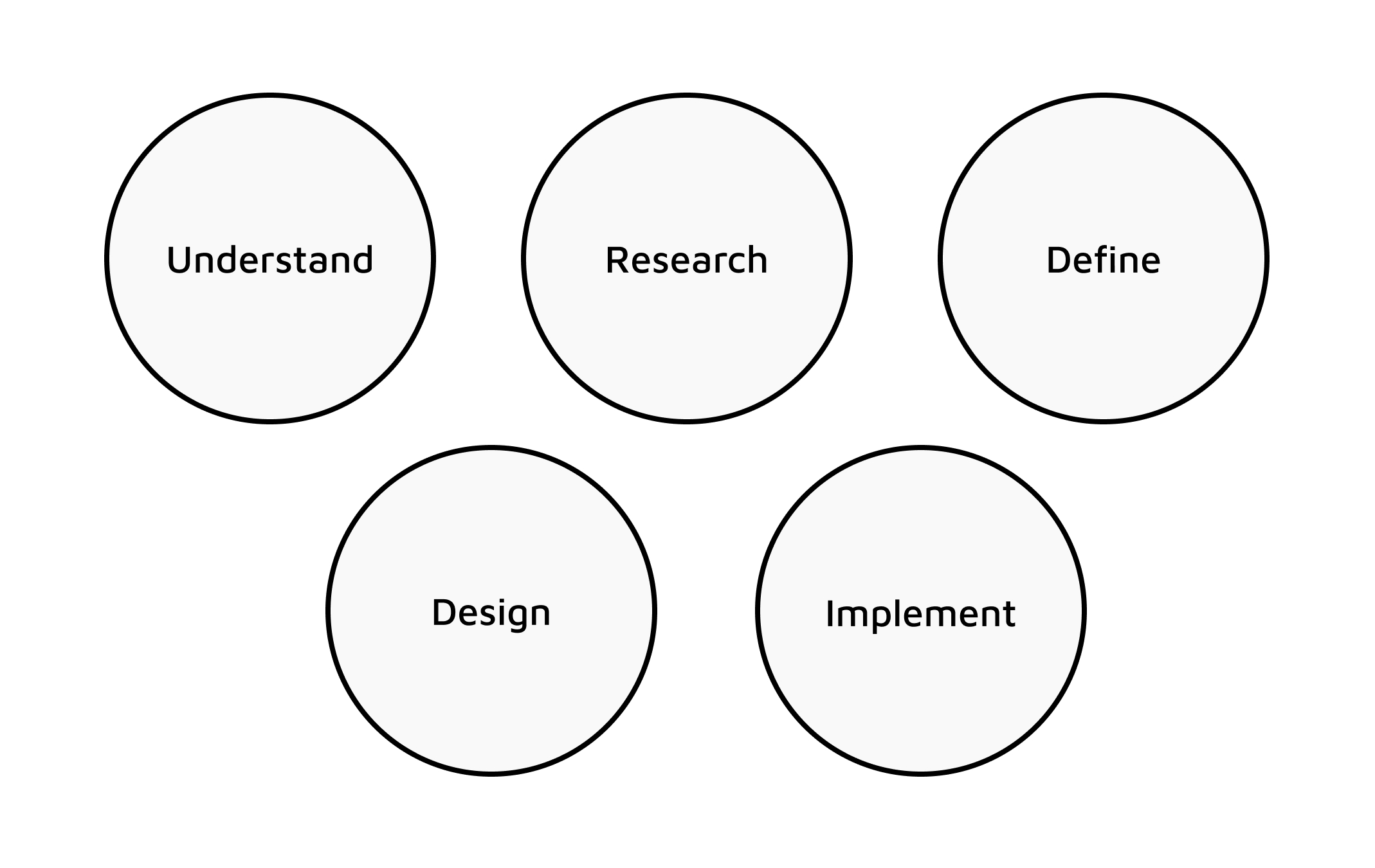
My design process is broken down into five main stages
As defined in the design process this section will indulge in acknowledging the motive for this product, defining who the user is and building use cases the user could find themselves in.
There are few select motives when a company decides to bring in a new design approach of an established product, aside from direct technological advancement. In this case, the replacement of the on- console interface with the mobile interface achieves two core ideas, cost reduction, and increased intimacy through IoT abilities.
More obviously, the cost reduction is achieved with a decreased number of components in the system, such as knobs, displays and other supporting structures in place to facilitate them. The increased intimacy can be achieved through a now-possible feedback loop that can be used to create custom features based on learnings from analytics.
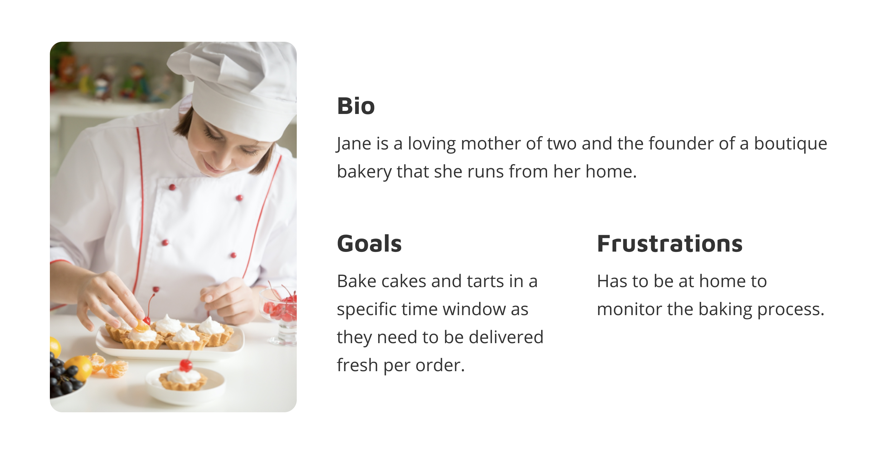
When designing a new product a company can achieve one of two things, creating a new user base or increasing user intimacy with the existing customer segment. In the current situation, the latter seems like the obvious choice. Thus the users of this oven are people who are accustomed to conventional ovens and are driven to perform the same tasks they would with otherwise.
Analyzing direct competition to a product is very important to understand user flows and features that could be benchmarked against. Three competing mobile apps would be GE’s Brillion App, LG’s Smart ThinQ App & Samsung’s Smart Home App.

Indirect competition is a fundamentally alternative that consumers use commonly. In the case of our oven, the indirect competition would be conventional ovens with an on-console interface.
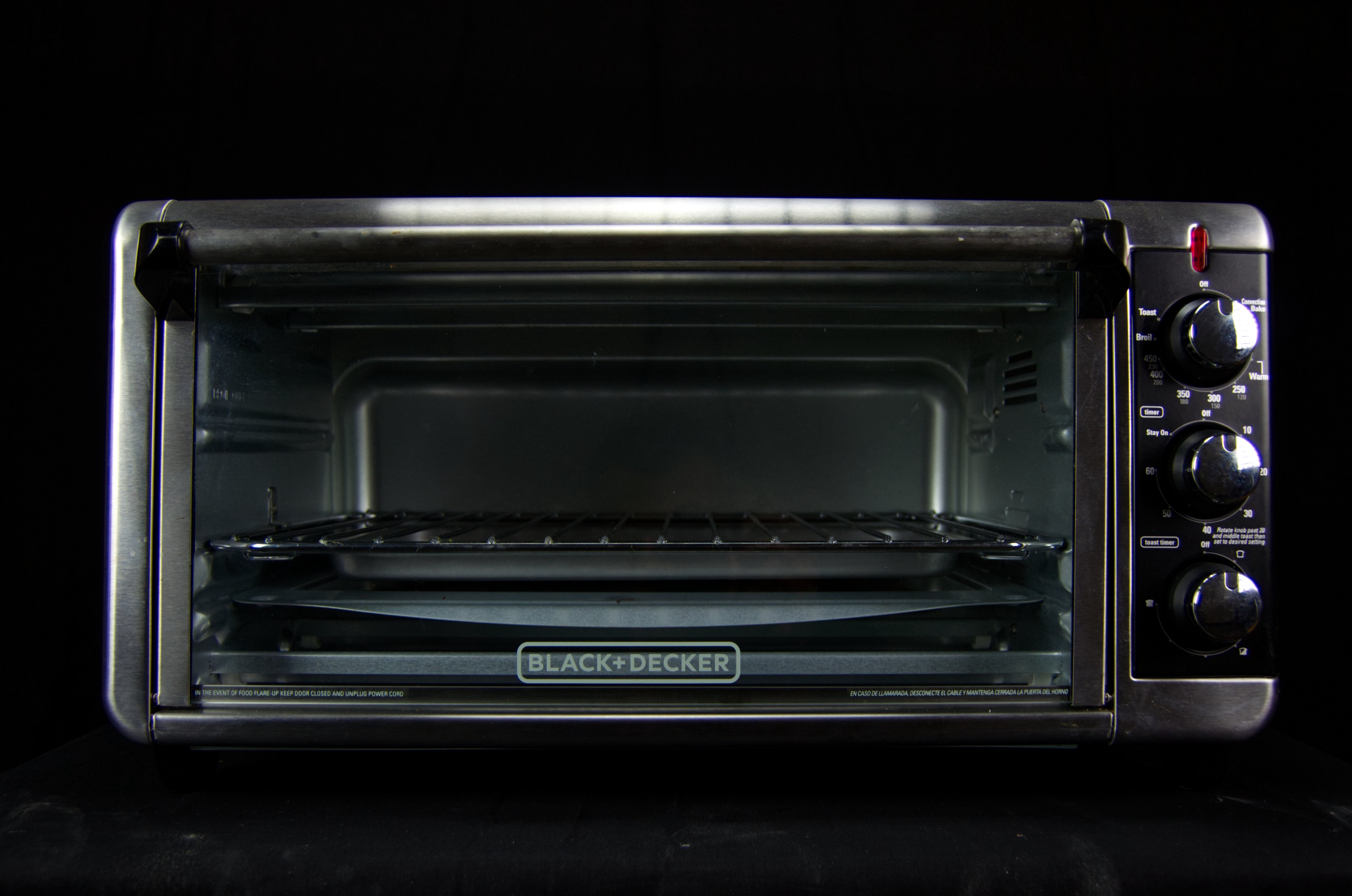
Conventional ovens allow users to add heat, temperature and time settings individually. The interface is usually three dials one for each setting option. Users can change settings on the go.
When onboarding people who are used to the 3D version of an object it is important to consider how we can give them a relatable experience for ease of adoption. For example, we can design dials to control the various settings. This could be possibly redesigned later when the app is more commonplace while adding features that are based on user analytics.
It is also important to have a tactile and auditory feedback system that also helps users to relate the hardware versions of the product. This can be achieved through subtle vibrations and ‘clicks’ when users interact with the 2D dial. Speaking of feedback, the other audio notifications such as timer completion should sound like a ‘ting’ sound of an oven and not an alarm clock. Additionally, the designs should be scalable — allowing more IoT products to be linked to the same App.
Now that we have understood who the user is, what her use cases are, and done research both on the market and associated trends we are ready to define the the application. This consists of establishing requirements, laying out user flows that satisfy the requirements and constructing an interface map that allows us to execute the user flows.
The following requirements or acceptance criteria are based on the outline of the challenge, the use cases, and the competitive analysis
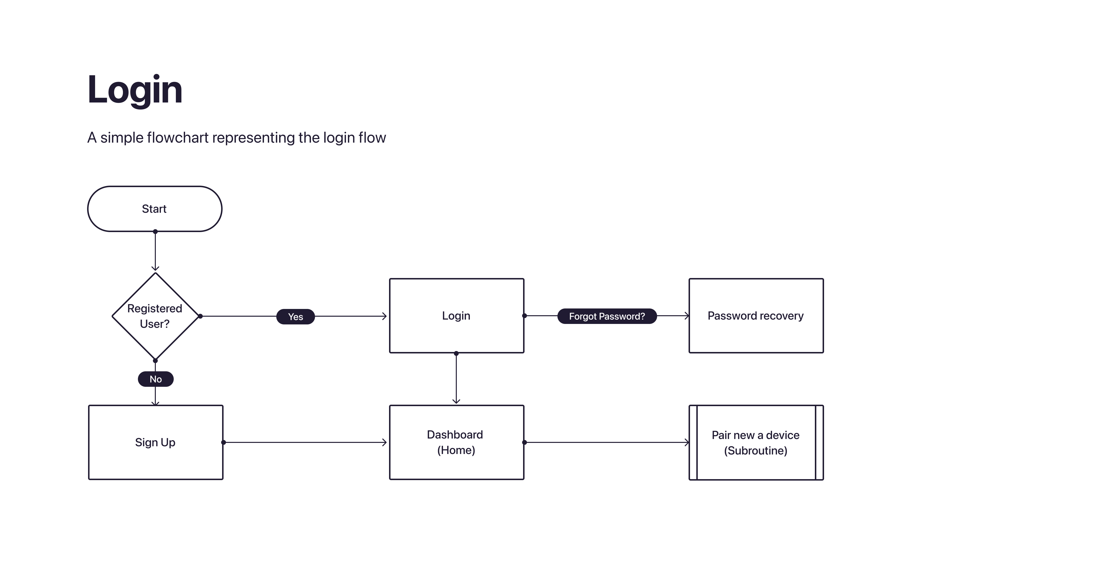
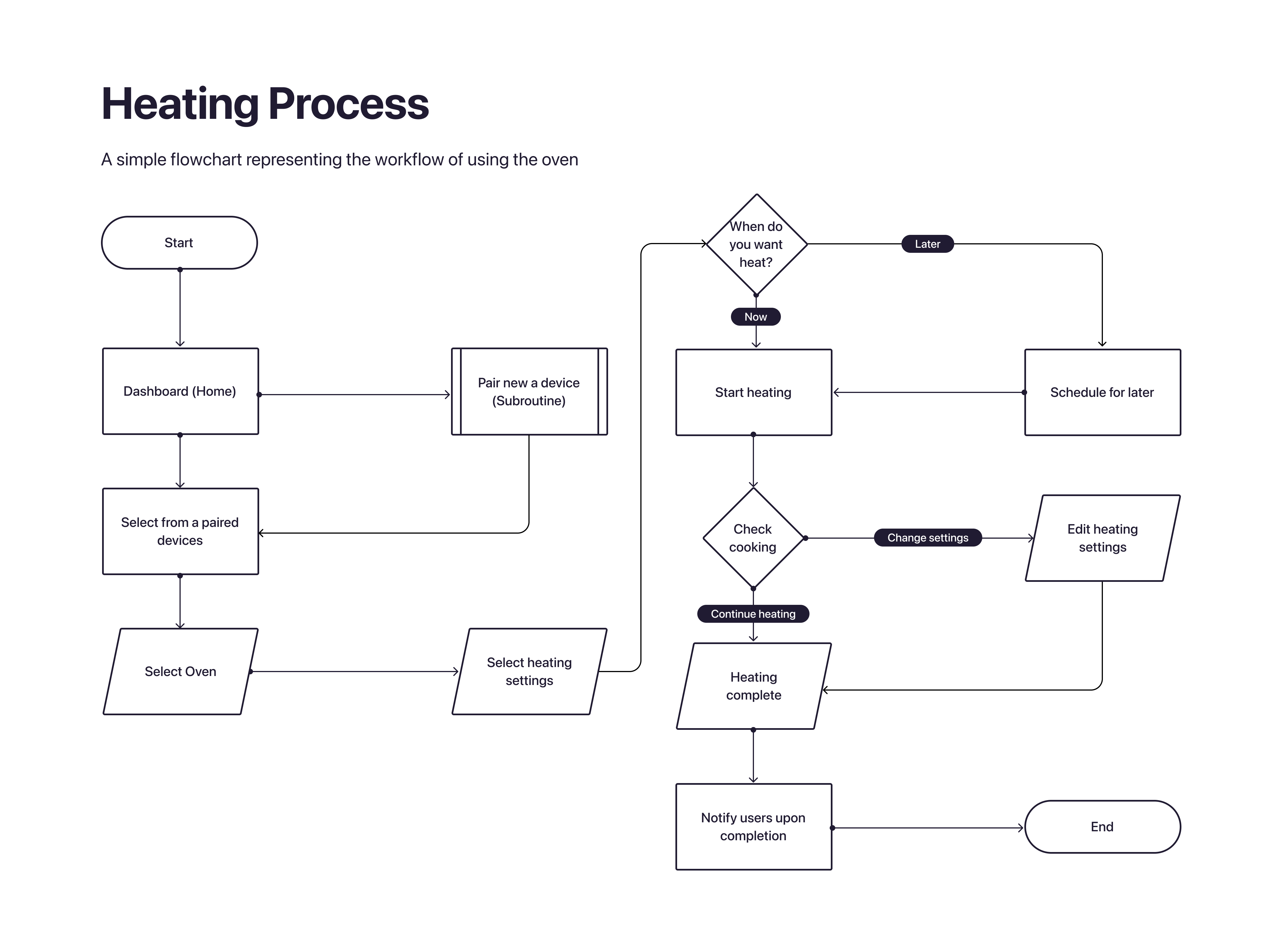
A user flow helps define the step-wise a user would take when using the platform. For the purpose of this challenge I have drawn out the login flow and the heating process flow.
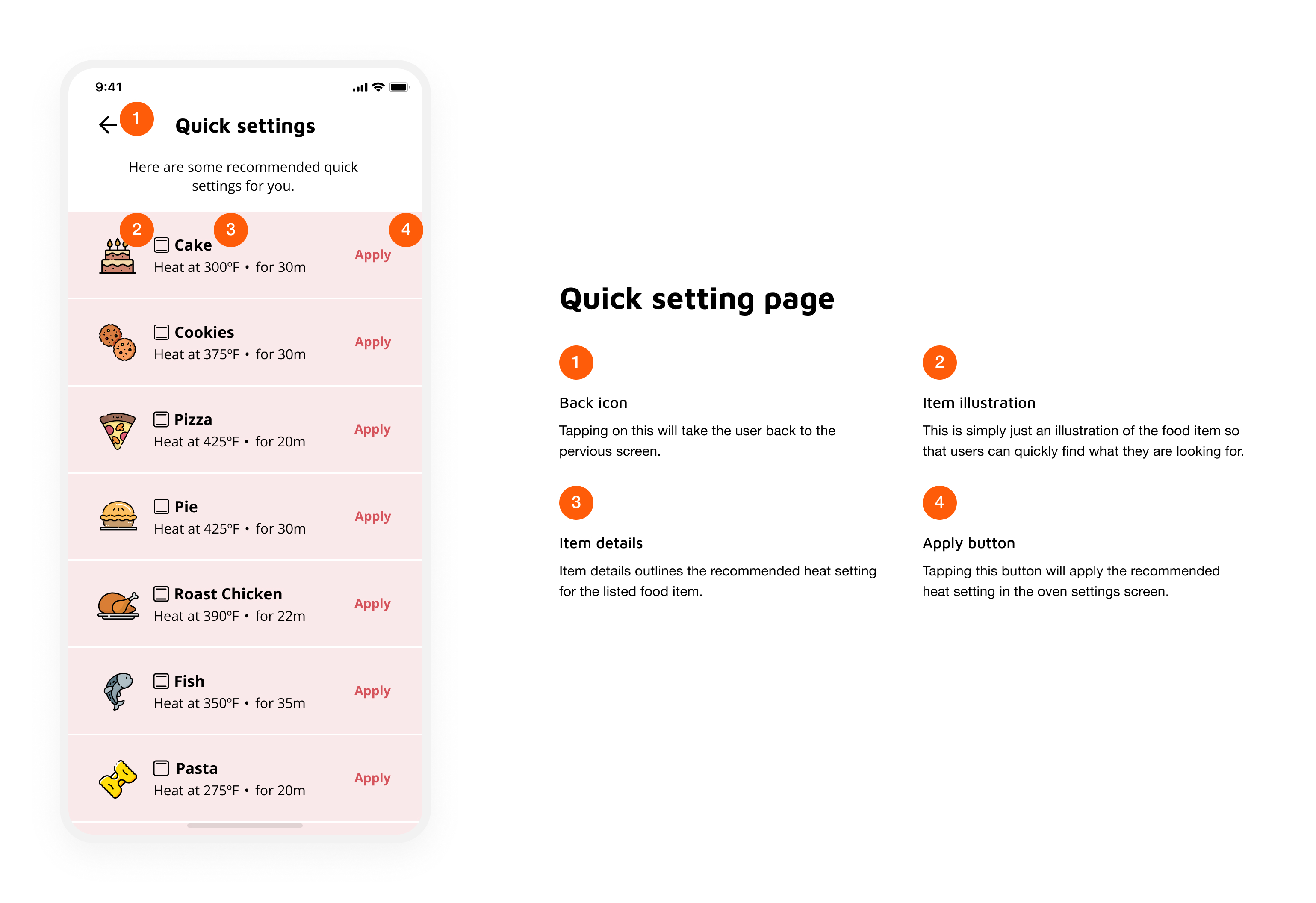
The interface map below explains the interfaces of the app.

Although the challenge only required me to design 2 essential screens at high fidelity, I designed an additional screens to ensure that I satisfy all requirement outlined to in the definition stage. To narrow down the scope of this task I decided to only design the app for an iOS interface; Specifically for the iPhone X generation.
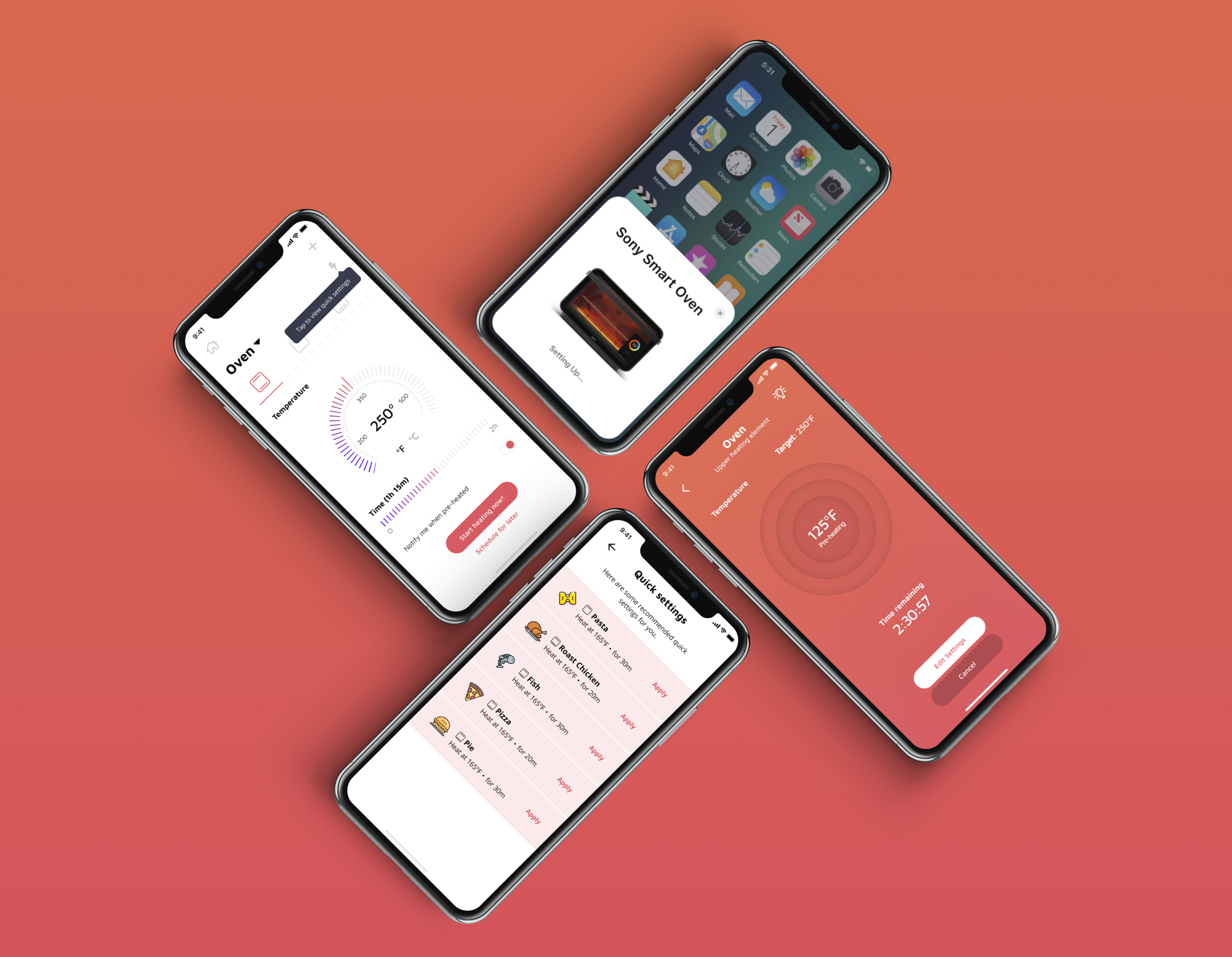
Traditionally, at this stage, I would try to design wireframes and mid-fi mockups and then test them out with users but due to the time constraints and the limited nature of this task I dove right into building the hi-fi designs. This first involved building out a small design system. I first decided to select colors and font, and moved onto designing icons, buttons and other intractable elements.
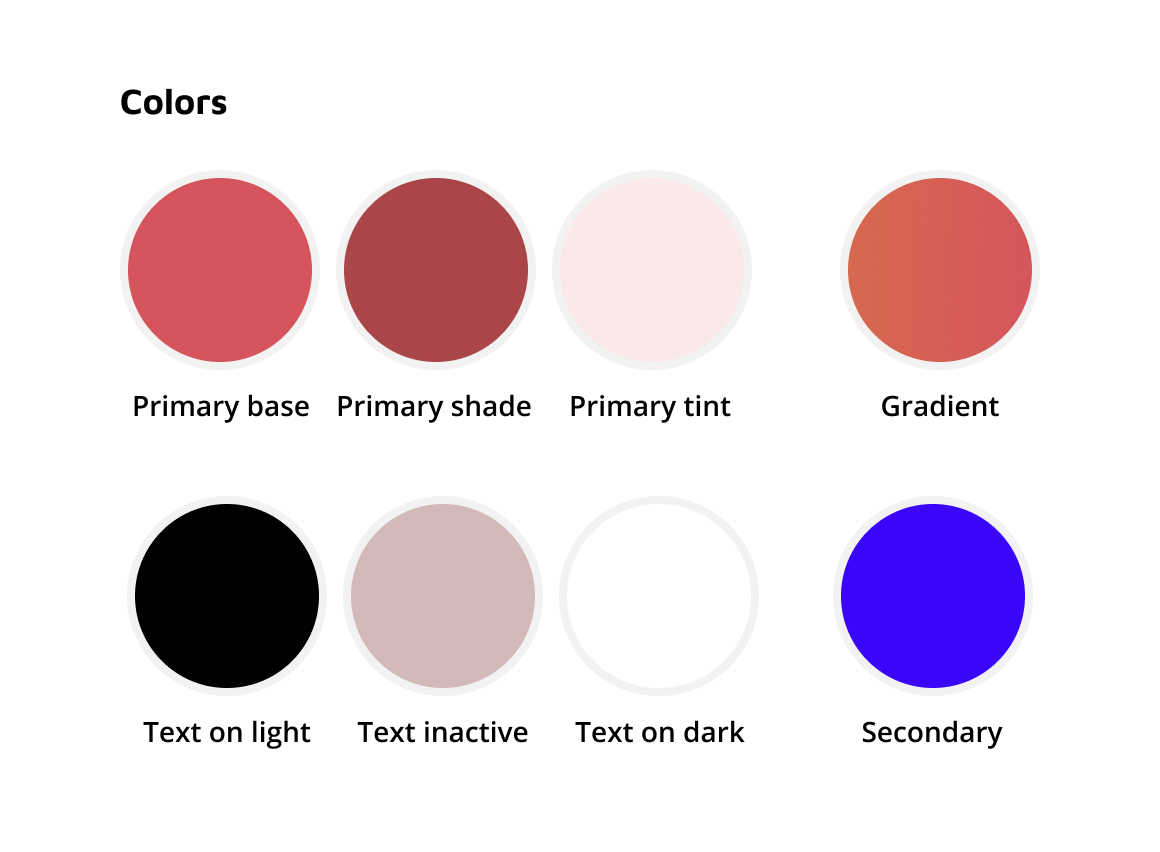
These are a basic set of colors used for the interface. The primary, secondary and gradient colors were selected due on the bases of looking welcoming and friendly while also providing an association to heating. Additionally, these colors are not close to any of the competitors giving the platform a visual distinction. The text colors were selected to have flexibility in visual hierarchy and readability (all text colors were accessibility friendly).
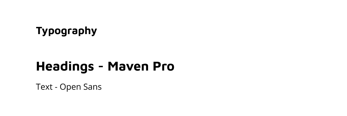
For the fonts I used Maven Pro for headings and used Open Sans for normal text blocks. Not far too much thought was put into this; I simply liked these font for the use case.
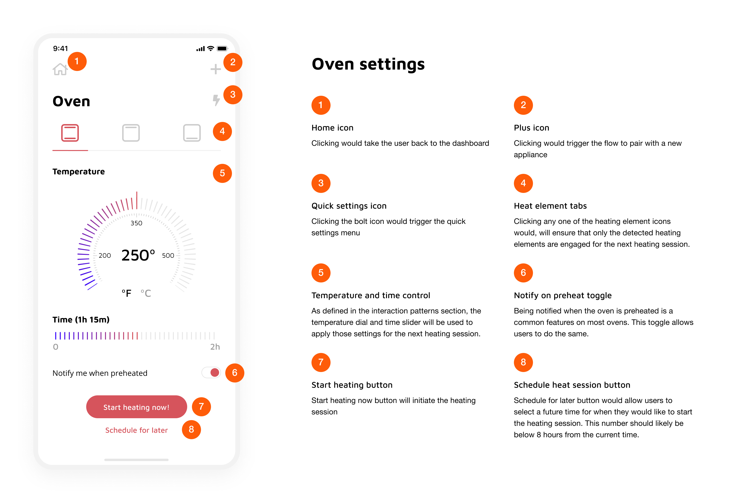
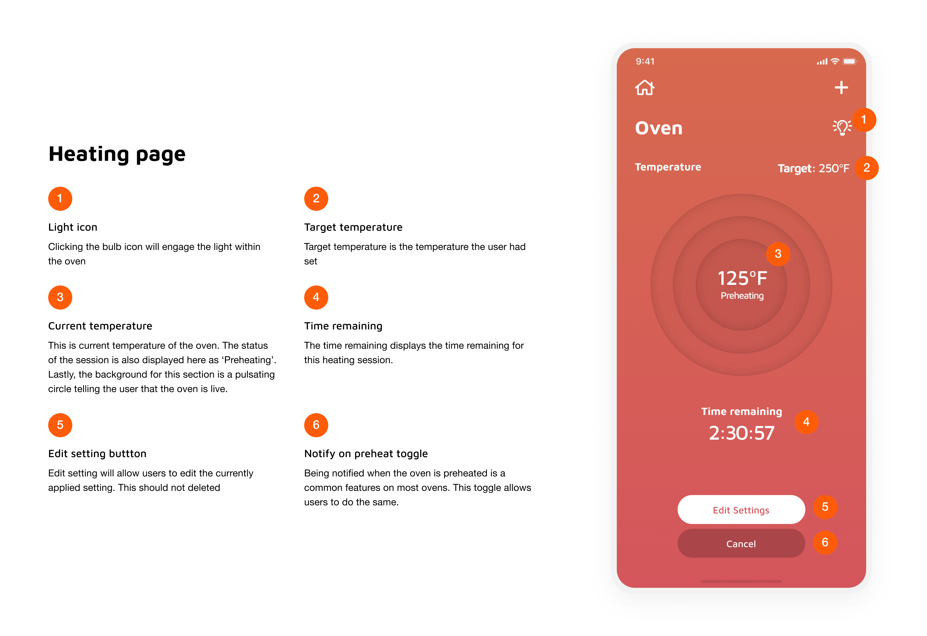
I initially started off with designing the interface icons. The first three icons, the plus, the house and the arrow, were for the general navigation of the system. The bolt was selected to toggle the quick settings menu. While the light bulb and heating element icons were designed as representations of different parts of the oven. The food items are some stock icons I picked up from the internet and only used to represent common dished using in an oven. Given the time and resources I would have sent out a survey out to some different segments of our target market and populated the most common items.
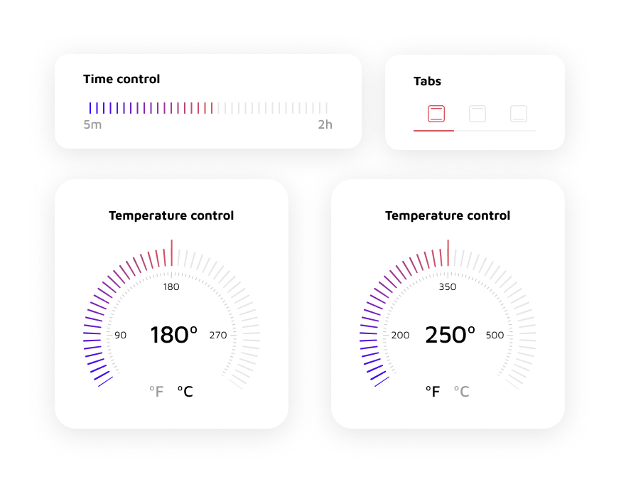
Finally, the interaction patterns. The tabs allow users to select which heating elements they would like to engage. Although, most ovens use terms like bake and broil to symbolize the engaged heating elements I felt that the visual representation are easier for users to grasp. In an ideal world I would try to run some A/B tests to ensure that my hypothesis stays firm. The time control is a simple slider ranged between 5 mins and 2 hours. The low and high limits were based on some basic research done on heating and reheating times for common food items. The temperature control dials were based on looking like dials which we see on ovens today. I have given the users the ability to choose between ºF and ºC assuming this product could be sold within and outside of the United States. The min temperature was set to be 50ºC or 125ºF and the max temperature was set to be 300ºC and 575ºF. These were based on the temperature ranges of commonly available ovens.
Since this project is simply a concept so there was no real implementation. However, the process would involve a technical review with the engineering and product teams to understand technical and product constraints. This would follow testing the product prototypes with customers to remove experience related quirks. Once a design has been frozen, I would prepare the designs for a technical hand-off.
After the feature has been developed, I would work with the QA to ensure the feature implementation is up to specs. Now that we have developed features, I would begin the cycle of testing the feature with users to ensure they are satisfied with the experience.
This design challenge was fun to work on since I have always dreamt of the day I could remotely control my kitchen. Although these designs only satisfy a small of the larger dream, it was still a step made in the right direction.
Designing digital products for hardware is interesting! Especially, since you are often refactoring the physical experience in the virtual realm.


